RESPONSIVE WEBSITE
Building trust and driving new client bookings by 56% through responsive website redesign
ROLE
UX/UI Design
UX Research
Wireframing
Prototyping
Brand Design
COMPANY
CV Acupuncture
stakeholder
Acupuncturist/ Founder

Problem
Christy Vitiello, a San Francisco-based acupuncturist and wellness expert, had a website that was not responsive, lacked a clear brand identity, didn’t showcase her services effectively, and made it hard for clients to navigate, undermining trust and deterring potential new bookings.
User tests revealed participants were not only unlikely to book, and only 1 of 5 would even consider booking this acupuncturist based on her website.
Solution
Reimagine Christy's digital presence by designing an updated, professional, and modern responsive website with an an intuitive online booking experience that fosters confidence in Christy's expertise, driving new business.
Impact
2.5x
2.5x the number of unique visitors to the site within the first 30 days of launch
+59%
New client bookings increased 59% in the first month post launch
+80%
80% increase in users who would consider booking, reducing potential drop off rates (from 20% to 100%)
+128%
128% increase in the Likelihood to Book Score (from 1.8 to 4.1)
How I got there
EMPATHIZE
Potential clients look for trustworthiness, comfort, professionalism, and price
User interviews with 5 potential users, a mix of acupuncture newbies and seasoned veterans, revealed what people expect, want, and need from an acupuncturist's website.


Usability Testing uncovered key pain points in the original site
Usability testing within User Interviews revealed participants felt the website looked antiquated, unprofessional, and confusing.
Only 1 in 5 participants stated they would even consider booking with this acupuncturist based on her website. Since most new clients come from referrals, this suggests online visitors were likely choosing other providers!
Only 1 of 5 participants would even consider booking with this acupuncturist based on her website
Confusing new client booking process
Confusion during the new client booking flow caused potential clients to lose trust and see this acupuncturist as sloppy
Outdated design & architecture
The layout and style feels dated and doesn’t accurately reflect the professionalism of Christy’s practice.
Inadequate information
Limited information for their services, pricing, and booking creates confusion potentially discouraging users away.
Poor responsivity to mobile
While available on mobile, the website did not scale well and was difficult to read and use.
Broken Booking Process
4 of 5 participants found booking a new client appointment confusing

Misplaced instructions
Users were confused as to when they needed to fill out the intake form and if it was required to be completed before booking.
Stagnant text instead of hyperlinks
Text looks messy and requires the user to copy/paste the link into a new tab, adding an extra step for the user.
Broken, unusable links
Links that lead to nowhere are frustrating and makes the acupuncturist look unprofessional.
Competitor websites prioritize clean, calming aesthetics, functional booking systems, and content aimed at educating and building credibility.
A competitor analysis of five solo acupuncturists in major U.S. cities (NYC, DC, and SF) identified industry standards and highlighted opportunities for Christy to differentiate and stand out.
User needs were clear
After synthesizing findings from user research, usability testing, and competitive analysis, several clear priorities emerged.
Easy Booking Flow
Users want to seamlessly book and manage appointments though the website.
Confidence-Inspiring Credentials
Users need to trust and feel comfortable with the acupuncturist, their background, credentials, and skills.
Price Transparency
Users need to understand the potential cost of each treatment and if/how insurance may factor in.
Modern UI Design
Users expect a professional and modern UI that accurately represents the provider and their standard of service.
DEFINE
Two key problems emerged
Goal: Reimagine Christy's digital presence by designing a responsive, professional, modern website with an intuitive online booking experience that fosters confidence in Christy's expertise, thus leading to new business.
Our user persona brought these problems to life
Creating a user persona helped ground the project in user needs and kept the target audience front and center throughout the process.
Meet Daniel! Daniel lives in San Francisco and is looking to acupuncture to help find lasting pain relief.

IDEATE
Key features would include the basics + differentiators
Basics:
Differentiators:
Card sorting validated the proposed information architecture
While a card sort may have been overkill for this project, I used a hybrid card sort consisting of 38 cards and 7 categories to practice this method and validate an intuitive, user-friendly information architecture.
The cards and categories were inspired by the content and categories on Christy’s existing website and that of Christy’s competitors.

Most participants grouped cards in line with my planned categories, confirming the structure made sense.
However, the “Specialties” label caused confusion for nearly half (47.4%), though participants still placed the cards correctly, indicating the concept was clear, but the wording needed refinement. This led to the following site map.

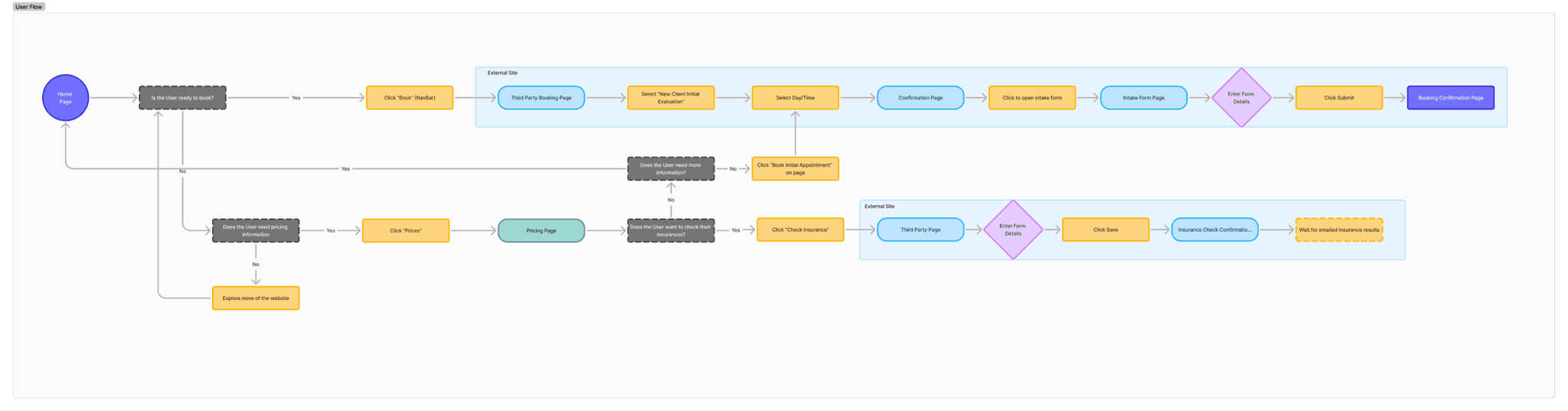
User Flow outlined on how new clients could book an appointment
I also designed a User Flow that outlined how a potential user would navigate the website and book their first appointment.
DESIGN
Wireframing let us explore diverse ideas
With the key features, IA, and user flow set, I developed low-fidelity designs that kept my user’s pain points and motivations top of mind.
I started with desktop designs since I found that the majority of my users most often research service providers on desktop over mobile.


After initial feedback, I developed the website content and quickly moved into mid-fidelity screens that included the new client booking flow using screens from the acupuncturist’s current third party website.


Mid-fidelity user testing confirmed the design was on the right track
I conducted a usability test with 6 participants over zoom to evaluate the experience and usability of the redesigned website. Overall, positive feedback validated the redesign was moving in the right direction.
However, testing revealed four key revision areas.
Updated branding focused on creating a sense of calm
During my initial user research, interviewees mentioned they expected an acupuncturist’s website to feel professional, modern, and calming.
This color palette was chosen to evoke a sense of calm, trust, and natural healing. The greens reflect balance and renewal, aligning with the holistic nature of acupuncture, while the touch of yellow adds warmth and approachability.

The high-fidelity prototype brought everything together
With the branding and UI kit developed, it was time to create the high fidelity wireframes and prototype.

Usability testing revealed significant improvements
High Fidelity usability testing among 6 participants assessed the improved usability and the perceived credibility of the acupuncturist based on the redesigned website.
+80%
80% increase in users who would consider booking, reducing potential drop off rates (from 20% to 100%)
+128%
128% increase in the Likelihood to Book Score (from 1.8 to 4.1)
67%
67% of user testers would book with this acupuncturist based on the redesigned website


Of course, a few more iterations were needed
In response to feedback, I implemented several key iterations:
Added a “Check Pricing” button to the Acupuncture Services page to make pricing more accessible and connected to specific services
Moved the “How it Works” message higher on the page to ensure more users see that additional services are included without needing to scroll
Revised the Pricing page to note which appointment types come with complementary services at no added cost.
Updated the intake form button on the booking confirmation page by brightening its color and adding a subtle shadow to improve visibility and appeal
FINAL DESIGN
CV Acupuncture's Redesigned Website
Next Steps
I’m excited to launch Christy’s new website and see its impact on her practice.
Monitor Key Metrics:
Increase # of
new client bookings
Improve % of new non-referral clients
Increase # of completed intake forms
If these metrics improve, we then plan to invest in a HIPAA-compliant digital intake form, which several users identified as their ideal experience.
